Another #MAKE Friday
/To follow on to our last MAKE project, we got interested in what other metrics we could display in creative ways. Again, we went to look at some less traditional measurements at my company, that reinforced or highlight the company values. It's interesting to display revenue or shipments. But we have plenty of ways to do that already with intelligent and mobile dashboards, etc.
Our head of HR suggested that we pick up the hours of volunteer time our colleagues contribute: as a standard policy, everybody at my company gets a paid day a year to volunteer at whatever charitable organization or institute is meaningful to them. It's one of my favorite benefits (obviously. Twice.) But the reality is that not enough people actually remember to do it.
If we make the metric more visible, would we see that change?
I have to think so. The pages printed has gone down since we deployed the cube. I think we can have an even greater effect on this fantastic benefit as well.
What I really wanted to create was a split-flap display - like you would see in old train stations. The clatter and the action of the split-flap is just fantastic. It draws you in, and strikes a chord with me because of the audible reinforcement of seeing the information change. Unfortunately, everyone has ripped those things out some years ago to switch to digital screens (yawn), and they're nigh-impossible to find. (although I did find one or two examples of building them entirely from scratch. But even I'm not that ambitious). Sure, you can fake it on a big screen, but that just didn't tug on my creative urges enough.
So we kicked this idea around for a while with the team, looking for an alternative idea that blended that tactile attraction, but was simple enough to do in the spare time of the few of us who were working on it.
One of the programmers on my team had a couple of old, cheap Android-based tablets. he made one of them into a single digit flipper and showed it to me. Voila.
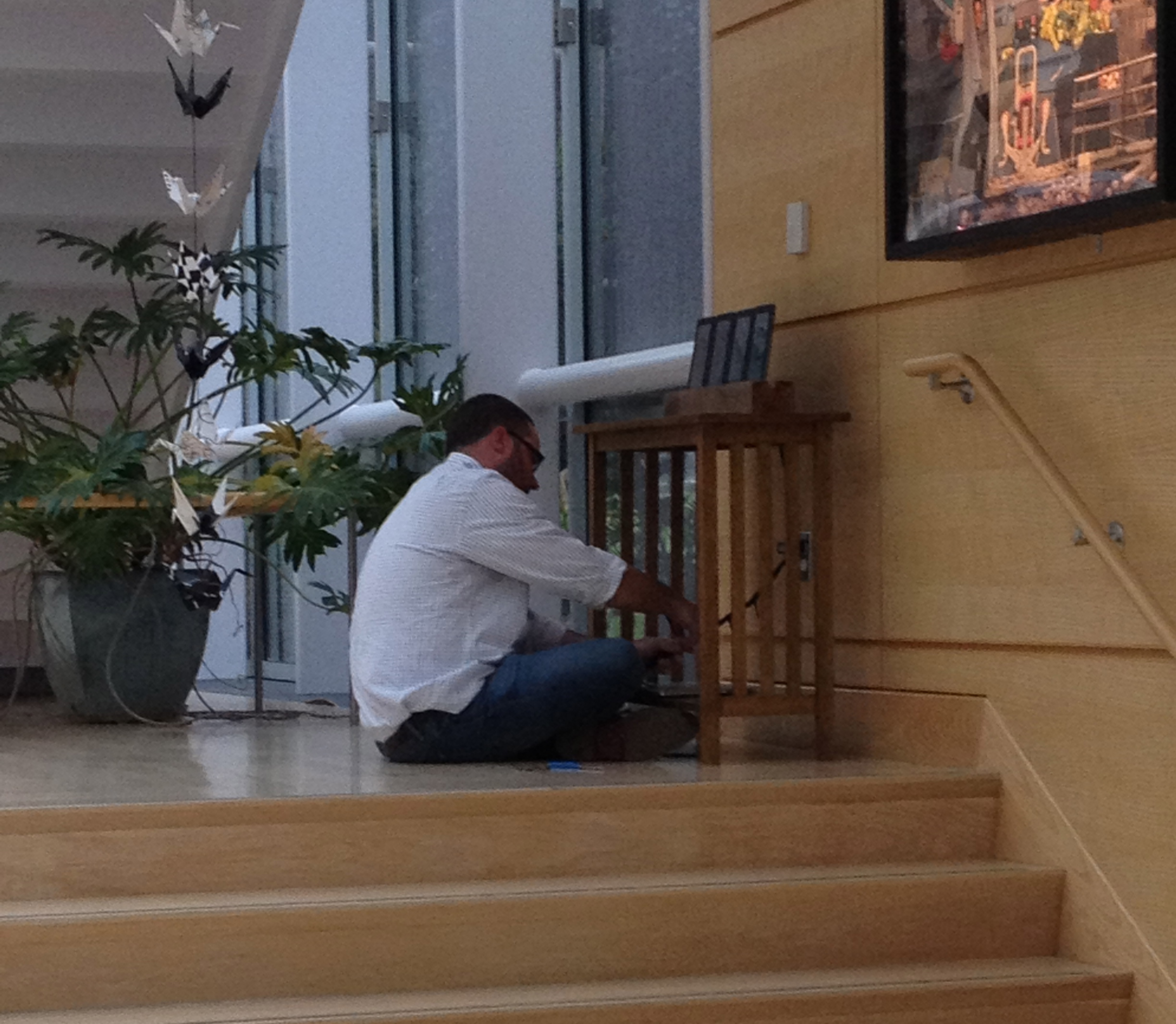
Let's just pile up a bunch of individual screens to do the trick, create a web service to change each counter, and nest the whole thing in something that 'softened' the digital aspect of the display. We bought a few more old tablets, and I took one of the leftover rafters from our 300 year old farmhouse that had been taken out and saved in my barn to create a cradle. We spray painted the non-screen parts of the tablet a uniform matte black to further take away the digital reminders (no buttons or logos needed), and a colleague from my team and I set it up in the hallway of the main office without telling anyone what it was.
We let it sit there for a week or so, displaying a number (267), smiling enigmatically when people asked about it. Our CEO was giving some partners from another company a tour - even with all of the art and scientific instrumentation surrounding it, this stood out enough for them to ask about it.
It wasn't labeled. It was just a set of numbers. It made people ask.
That's exactly what we wanted.
After about ten days, we released another video - I wrote the script, but yet another one of our team voiced it. Again, I think this said it better.
This one was a great collaboration amongst my team. It was fun to see how into it different people got, and certainly met the objective of both producing something that combined utility, creativity and artfulness, and of getting the team inspired to innovate and think differently.
We've got another project on the design board that'll combine a couple of the best parts of each of these.
More fun to come!


