The Wolf of Bedford Road

A few weeks ago, my 11 year old daughter came downstairs and told me, "Dad, I want a new phone." 

"Uh-huh, Critter. Let me know how that works out for you." 

We got her a phone last year. I was pretty much against it at the time, and I still have distinctly mixed feelings about it.  But she's involved in more after-school & extra-curricular things. She calls us when she needs to be picked up from the stables. She can ring us when she needs to stay later at the library. And we can use "Where's my phone" apps to check in on her progress when she's biking around.  The phone is handy, and she's responsible with it. She's never lost it, and she doesn't text or talk like crazy on it.  I'm just old-fashioned enough to begrudge giving a kid a phone.

We got her an older iPhone in one of those "free extra phone" deals when my Bride renewed her contract. It's serviceable. She doesn't have her own account. And she has to ask us to buy or download anything. The deal has been that if she breaks or loses it, she gets to pay for the replacement. And I get all the passwords, forever. And the stated assumption that I will read every mail, text or note. I'm in IT. I can do that. 

The phone she has is definitely slow, and it's more than one generation out of date. But whatever. It's a phone. And it's perfectly capable of doing phone-ish things. So when she came downstairs and said she 'needed' a new phone. I just laughed. 

"Go ahead an buy whatever phone you can afford, kid." 

"Ok. I'm going to get the gold iPhone 5s."

"OK, Sweeti -- Wait.  What?" 

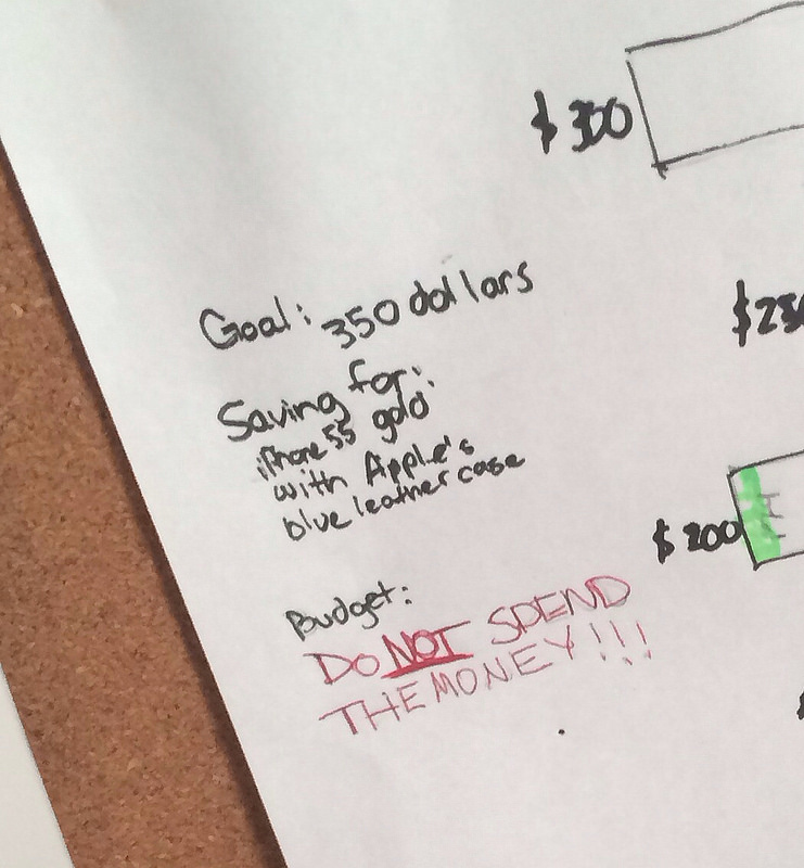
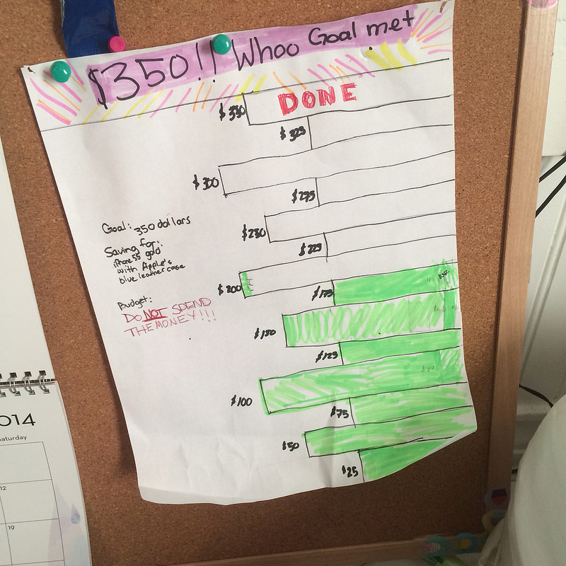
She pulled out a hand drawn chart & a wad of bills from her pocket and started counting. She had calculated how much she'd need for the phone, the case she wanted, and sales tax, and made up a hand drawn spreadsheet.

Let's be clear: Our kids have never received an allowance. And that's not about to change.  Any money the Critter gets comes from collecting, boxing and selling eggs to our neighbors at three bucks a dozen, the occasional farmer's market scheme (she has sold duct tape wallets and doll blankets she had made a few times), and a little bit of birthday money from the grandparents.  Occasionally, I might throw her a few bucks to wash my car. (Very occasionally. I don't remember to wash my car more than once a year or so).

And? We make her take 1 out of every 3 dollars, and put it in the bank.  

When she was done counting, she had over $300 in a pile. This kid has more disposable income at 11 than I did when I was 31. 

But instead of the ~$100 dollars that would've gone into the bank, she kept back only $175. The rest she said would go into savings. Then she colored in her chart and hung it next to her bed with some stern warnings for herself. 

She printed out a picture of the phone she wanted, and tucked it into her own duct-tape wallet. "As a reminder," she told me. "That way, whenever I go to spend money, I'll see it, and maybe think more about saving the money instead." 

Then she went to the library and checked out a couple of books on small business ideas for kids, and announced to our friends that she was available to help tutor their young children. She talked to the Boy's tutor about techniques and started lining up gigs at $6 an hour. 

Next week, I'm going to ask her to review my capital project request that I've put together for our company Board of Directors review and give me a few pointers. 
Another #MAKE Friday

To follow on to our last MAKE project, we got interested in what other metrics we could display in creative ways. Again, we went to look at some less traditional measurements at my company, that reinforced or highlight the company values. It's interesting to display revenue or shipments. But we have plenty of ways to do that already with intelligent and mobile dashboards, etc. 

Our head of HR suggested that we pick up the hours of volunteer time our colleagues contribute: as a standard policy, everybody at my company gets a paid day a year to volunteer at whatever charitable organization or institute is meaningful to them. It's one of my favorite benefits (obviously. Twice.) But the reality is that not enough people actually remember to do it.  

If we make the metric more visible, would we see that change?

I have to think so. The pages printed has gone down since we deployed the cube. I think we can have an even greater effect on this fantastic benefit as well. 

What I really wanted to create was a split-flap display - like you would see in old train stations. The clatter and the action of the split-flap is just fantastic. It draws you in, and strikes a chord with me because of the audible reinforcement of seeing the information change. Unfortunately, everyone has ripped those things out some years ago to switch to digital screens (yawn), and they're nigh-impossible to find. (although I did find one or two examples of building them entirely from scratch. But even I'm not that ambitious).   Sure, you can fake it on a big screen, but that just didn't tug on my creative urges enough. 

So we kicked this idea around for a while with the team, looking for an alternative idea that blended that tactile attraction, but was simple enough to do in the spare time of the few of us who were working on it. 

One of the programmers on my team had a couple of old, cheap Android-based tablets. he made one of them into a single digit flipper and showed it to me. Voila.  

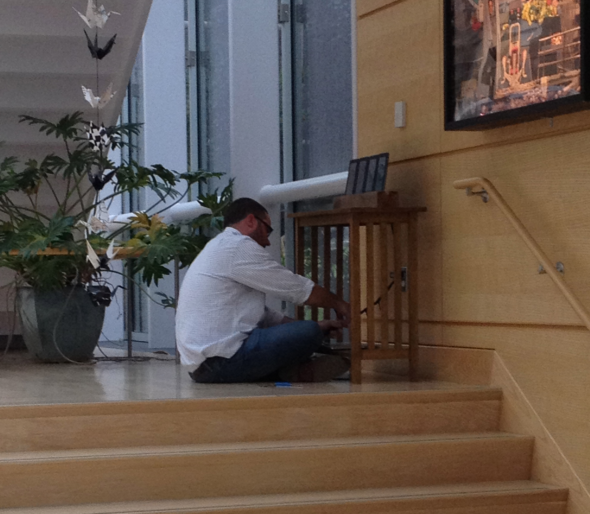
Let's just pile up a bunch of individual screens to do the trick, create a web service to change each counter, and nest the whole thing in something that 'softened' the digital aspect of the display. We bought a few more old tablets, and I took one of the leftover rafters from our 300 year old farmhouse that had been taken out and saved in my barn to create a cradle.  We spray painted the non-screen parts of the tablet a uniform matte black to further take away the digital reminders (no buttons or logos needed), and a colleague from my team and I set it up in the hallway of the main office without telling anyone what it was. 


IMG_3178.jpg

We let it sit there for a week or so, displaying a number (267), smiling enigmatically when people asked about it.  Our CEO was giving some partners from another company a tour - even with all of the art and scientific instrumentation surrounding it, this stood out enough for them to ask about it. 

It wasn't labeled. It was just a set of numbers. It made people ask. 

That's exactly what we wanted.  

After about ten days, we released another video - I wrote the script, but yet another one of our team voiced it. Again, I think this said it better.  

The flip counter meter we created with some re-purposed android tablets and a little creative app writing.

This one was a great collaboration amongst my team. It was fun to see how into it different people got, and certainly met the objective of both producing something that combined utility, creativity and artfulness, and of getting the team inspired to innovate and think differently.

We've got another project on the design board that'll combine a couple of the best parts of each of these.  

More fun to come!  

#MAKE Friday - Ambient Cube

Late last year, I had begun thinking about some new ways to communicate information across my company. I am fascinated by a) taking information that you either rarely (or never) look at and making it more available, and b) bored with bar charts. 

There's a lot of ways to communicate information. But we seem to get stuck in the same ways old ways we have always used, because they seem simple, we've trained ourselves to use them, and so we reach for them out of convenience. But with the sheer amount of information available to us at any given time, putting more data into the firehose won't result in anything actionable or noticeable unless it's either truly compelling, or interesting enough to stand out. 

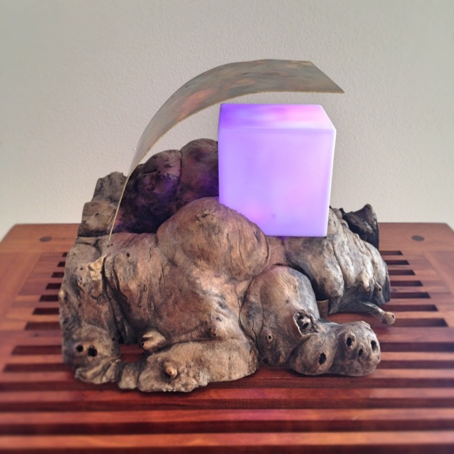
I was taken with the idea of the ambient orb, and began playing around with ways to build one myself. It took a little bit of finessing to figure out exactly how I wanted to set it up. The biggest challenge is to get enough light out of the LEDs to be visible in all situations. A single LED just isn't gonna cut it when the sun is up and shining through the window.  But just as importantly as the technical aspects, I was determined to make the object pretty. It had to fit into the ambience of the area I intended to put it - the lobby of a multi-million dollar scientific facility, surrounded by works of art and natural beauty. 

So of course, I turned it from an orb to a cube. 


The lighting was brightened by using a BlinkM MaxM LED - a stupidly bright RGB LED that is super easy to work with. I tore apart carefully disassembeled an old, non-programmable ambient orb to see how they had tackled the diffusion. Answer: frosted wax paper. Engineers are a practical people. The cube came from some $5 Amazon toy - I threw all the functional part of it away, and just kept the plastic cubey bit. 

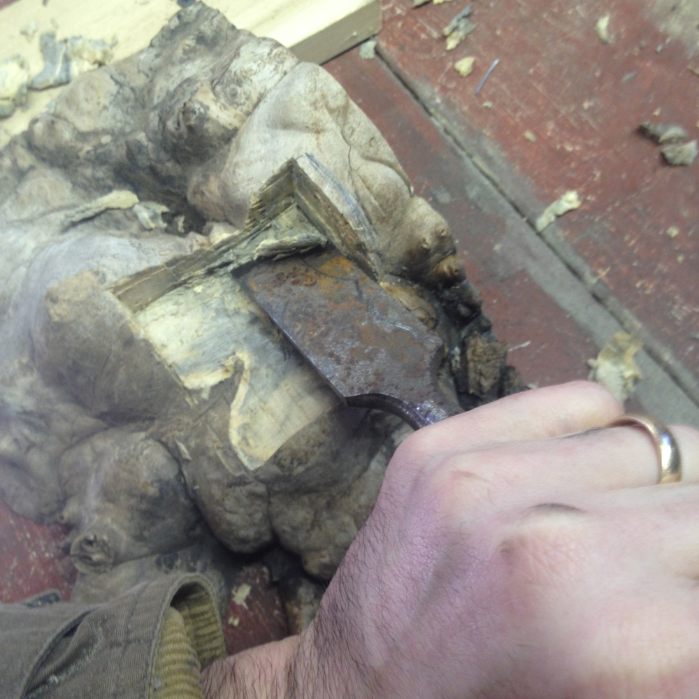
Now for the base. I took a piece of burl buckeye that I had in my workshop, and carved back the suface to accomodate the cube. I haven't done much carving, but I love working with this wood. I've made some small box parts out of it in the past, and it is both light and dense (a great combination for woodworking, but a bitch on the sawblades). Best of all, it has a gorgeous natural grain that is warm and interesting. 


Never mind the rust on my chisel. My barn isn't hermetically sealed, and it's a constant battle with my steel tools. 

I routed out the underside of the block to accomodate the arduino board and components (I installed an ethernet shield on it as well), and drilled a hole through the center of the square cutout to slip the LED through. Then it was just a matter of plopping the cube into the slot. 

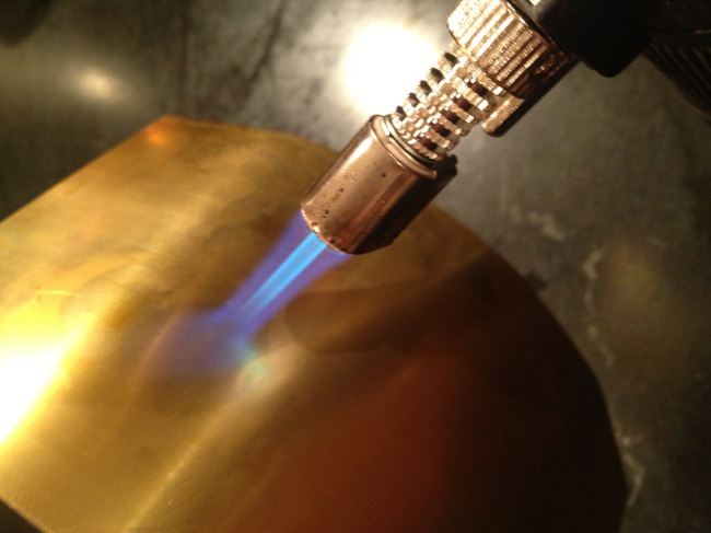
It still didn't look quite finished to me. I also knew I'd be putting it out into a rather sunny location. Even with the MaxM LED, in direct sunlight, it has to be pretty bright to be seen. So I grabbed a small sheet of stock rolled brass, and bent it into a shade. To keep with the artsy feel, I used a torch to discolor and oxidize the brass a bit. 

Added bonus: Fire! 


The little sketch I wrote for the cube can be found here - pretty straightforward (you will need the BlinkM_funcs.h and WebServer.h libraries as well). But you set the IP of the ethernet sheild, pass the color you want the cube to turn in standard RGB values via a webservice, and it shifts prettily to the next shade.

Several applications of danish oil to protect the base and And boom. We have ourselves a remotely programmable ambient cube, that can automatically be set to change as any metric we choose to monitor shifts. Here it's set to "purple." 


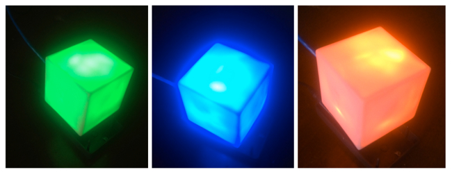
The idea for the metric is simple. We picked paper usage for the campus, because environmental stewardship is an important core value for our organization.  But we could've picked pretty much any goal.  If the cube is red, we used less paper yesterday than we did the day before.  If it's blue, we used about the same. If it's green, we used less. 

While we played with different and more complicated algorithms, the goal is just to do a little better every day. If we do that, it adds up to thousands of pages saved each year.  The numbers are easy - our print servers record every print job by printer, sender, page type, etc. anyway. All we had do to was setup a simple automatic comparison, and send out a little nightly web call to the cube. 

By putting it out in the lobby to be seen as people walk in each morning, it becomes both a visible reminder of our core values as an organization, and an opportunity to reflect on our choices. 'Oh. Today is a red day. Maybe I won't make as many copies of that report, and will just email it instead.'

But we said it better in a video - I put this together for internal communication. It explains the concept and the meaning. 


And there you have it. Information presented in an interesting fashion that becomes actionable, for less than fifty bucks and a few hours of effort to put together.