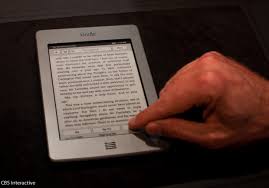
It's officlal. After this Christmas, we've become a multi-Kindle family.
My Bride and I agreed to give each other a new Kindle Touch for Christmas, upgrading from her old 2nd gen Kindle (the one with physical keyboard and the superbly non-touch screen, which I rediscovered after jabbing it multiple times every time I picked it up to play with it). We also each have an iPad 2, so we definitely did not want a Kindle Fire.
This wasn't about getting a new pretty tablet. I just wanted a book I could read in the sunlight that didn't also have email. (Why yes, in fact, I do realize what an nauseatingly 1st world post this is. Go ahead. You can throw stuff at us anytime you want)
After a couple of days of living with the new Kindle, here are my summary thoughts:

Kindle Touch vs. the iPad w/Kindle app: I've wanted a Kindle for a while now. I made the switch over to an e-reader as a default about 2 years ago now, on my iPad w/the downloade Kindle App.. I probably buy more than 90% of my books in digital format at this point (the exception being cook books and certain business books. i.e. those that have a large chance of having something splattered on them or loaned out), virtually all of which come from Amazon.
For even longer than me my Bride has been an all-digital reader with her aging Kindle. And I've been jealous of both her reader's insanely long battery life (a friggin' month. What, did Bezos put a little nuclear reactor in there?), and her ability to read in daylight without resorting to awkwardly improvised shade props.
I also really, really, REALLY wanted to return to a time when my book didn't actively try and distract me from, you know, reading. Hey! Check your eMail! And your Facebook! And maybe that app that lets me see the webcam looking at every active volcano in the world! That's all really cool, but I want to actually read now. And don't say "self-control," because that is so last millenium. (Another reason we didn't even consider the Fire).
The Cons: I was excited to open the Kindle. They arrived several days early, and the pair of them sat, wrapped under the Christmas tree, quietly mocking us with their inaccessibility. But we forced ourselves to be patient. We opened them Christmas morning, and set them aside after only a moment of basking in the new-digital smell and patiently constructed lego cities and other various kid-booty with the children. When we returned to them later in the day, we sat down to set them up with our individual accounts.
Thing you should know number 1: Kindles are not made by Apple.
Yeah, ok. That's obvious, right? But when they say "Touch" - they aren't talking about your elagantly intuitive iPad/iPhone interface that your 4 year old can pick up and use without instruction. You actually have to read the manual on this one. Where you touch on the screen is all part of the study-and-learn interface that you simply can't get by without spending some time to assimilate. It took me an hour to figure out why I kept jumping ahead 30 or 40 pages at a time because I tried to skip this step. (swipe up? Advance a chapter.) The touch interface is a little bit sticky, a little bit clunky. Not clean and graceful.
Things that will bite you in the ass number 2: Transfering stuff to your new Kindle does not work the way you think it should.
Once again, if you're spoiled by the ease of the Apple "Let me do that for you" magic, you will be disgruntled. I wanted to be able to tell my Kindle who I was and have my current library offered for download. It does not. Frustratingly, it seems like that's what you can do. If you go to the website on your computer. But if you've arranged your books in collections, and want to have your personal organization migrated wholesale, you're going to be disappointed. You can migrate the "collections" (read: 'folders'). But then you have to individually download the books again one by one. (each one only takes a few seconds, but if you've got dozens already... that's a lot of scrolling and clicking.
I admit that I couldn't really understand this particular irritation that well at first. This was mostly my Bride grumbling for half an hour or so, trying to migrate things. I had never actually used collections, because on the iPad Kindle App, the scrolling and archiving worked so simply and beautifully that I never really needed that functionality. After a couple of days on the Kindle, I can see however that the scrolling definitely does not work so beautifully, and suddenly the advantage of collections becomes more clear - breaking your library into manageble portions.
I also had some frustration turning off the ads on one of the two Kindles. I went to the website and "unsubscribed" (I do not want my book to sell me things, even if I have to pay an extra $30 to make it stop). It worked perfectly on mine, but I had to do a full power re-boot on my Bride's for some unknown reason. Which meant I had to figure out how to do a full power re-boot, as that was also not obvious. (another trip to The Google).
Also? Included is a USB cord, but not a power adapter. So you're either going to plug it into your computer to recharge, or spend the extra 20 bucks or whatever on the power adapter. Just be aware.
The Pros: Most of the frustration with the Kindle comes in the setting up and navigation. (And if you're not trying to transfer from an existing account, you probably don't have much in the way of the first issue). None of that works quite the way you think it should, and you're going to want to be at your computer managing your account there, rather than on your Kindle itself.
However, once you're set up and through the grumbling, the Kindle does start to shine. The physical form is simply lovely. It fits extremely comfortably in one palm, without the sometimes-annoying landscape/portrait re-orientation of the iPad interface (when I forget to lock or unlock that.) I admit my bias towards my book pages being taller than they are wide. That is the way God designed books, and how they always should be. Even when I'm lying on my side.
The Kindle is astonishingly light. True story: I have a small scar on my head from letting my iPad drop onto my forehead while reading in bed. My eyes closed, and WHACK. Suddenly I was bleeding. And I had to explain to people for the next week that the scab across my forehead was an iPad-related injury. And then deal with the resulting "You poor, poor idiot," looks. This is almos guaranteed not to happen with a Kindle. Unless maybe you sharpen the sides into a knife-like edge. But that risk is on you.
Somehow, even when you factor in all the intial disgruntlement, the Kindle just feels good to read. More... book-like than the iPad, for lack of a better term. Even with all its clunkiness of interface and nigh-waterboarding expierience of setup, once I had it ready to roll, I was instantly hooked. The digital ink is somehow much easier on the eyes than the lighted iPad screen, and I'm reading even more than before. It doesn't eMail, and it doesn't 'post' to my 'wall' and I'm happy about it. (though I do see hints of that functionality buried in the OS. I'm avoiding it.)
It's also dirt cheap, comparitively. Again: a month of battery with free 3G access for $150. (and no ads for a few extra bucks). It fits into my coat pocket in a way my iPad never would, and suddenly I'm back to never having to do without my book again.
All in all, we're definitely happy with the Kindle (the Critter is inheriting my Bride's 2nd generation version), and sticking with it as our primary reading device. I'll keep the iPad (mostly for work for me, and for occasionaly Netflix access on long trips when the kids need pacifying). But I would gladly recommend the Kindle to anyone considering an eReader with little hesitation.
I will be glad, however, when the folks at Amazon finally figure out how to make 'touch' feel as good as Apple do.


